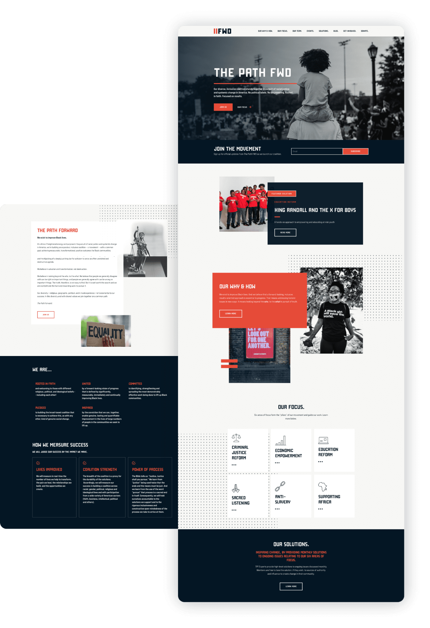
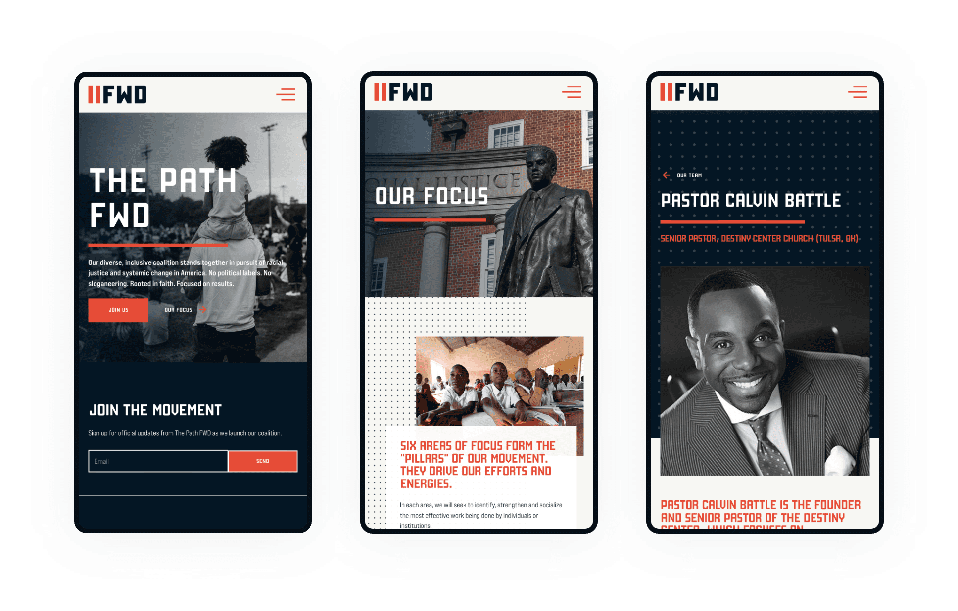
A “forward-thinking” design that breaks the traditional mold.
The Path Forward – a diverse, inclusive coalition that stands together in pursuit of racial justice and systemic change in America. No political labels, no sloganeering. The Path Forward is rooted in faith and focused on positive results. In the midst of all of the challenges 2020 brought us, this felt like the perfect opportunity to use our skills for a great cause.
WEBSITE
An eye on the past with a focus on the future.
Their stunning new website delivers a strong focus on company offerings and history, highlighting past and present commercial real estate projects, clientele base, and their extensive portfolio of properties and 3rd party listings.


BRANDING
Powerful, simple and ambiguous.
The logo mark for The Path Forward is powerful, simple and ambiguous. It can be defined as a play/pause button, or as an equal sign. This particular design nods toward a simplistic representation of a pathway, or “a path forward”. The shorthand wordmark written as “FWD” references the idea of “fast-forwarding” into a better future.
Iconography
Conveying the message of unity and hope.
These custom icons were designed to reflect the nature of the coalition and communicate its mission to the public. They were designed to be easily recognizable and memorable, helping to spread the message of unity and hope.
Iconography
Conveying the message of unity and hope.
These custom icons were designed to reflect the nature of the coalition and communicate its mission to the public. They were designed to be easily recognizable and memorable, helping to spread the message of unity and hope.


“We strongly recommend Michael & his team. After two years, we continue to work with them and they continue to provide results.”
Name Here
Title Here